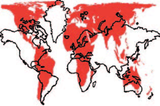
Jane Elliot criticizes our traditional map of the world, the so-called Mercator projection. “All the white countries in the world take up half the land. This is not a true picture of the world. This is racist teaching.”
Is she right or is this an exaggeration?
It is true that the map we use nowadays severely distorts the shapes of the southern, non-white continents: South America, Africa, and Asia. Here are some examples: Africa (11.6 million square miles) looks as if it were at least two times smaller than the Former Soviet Union (8.7). South America (6.9) is almost twice the size of Europe (3.8), but on the map the two continents look about the same. The most interesting case is Greenland. With only 0.8 million square miles, it appears on the map to be the size of Africa, which is 12 times bigger than Greenland!
This shape of the map was surely convenient for the European colonial powers. They were in the center of it and looked much larger than they really were, whereas the colonies were diminished and made to look less important, even on the map.
However, it is controversial to state that this was the reason why the map has been so widely used.
Cartographers have always had to deal with the following problem: Do we want to present the exact shape or the exact size of the continents? If we choose shape, the size is deformed. If we choose size, the shape is distorted. The Mercator map shows the precise shapes, so the sizes are changed. It was particularly useful for navigators because they could see exactly what the continents looked like. No racism, just practicality.
Or is it? One thing is certain: Changing the map will not change racist views.


